
Hero, Sticky Navigation & Intro Components
Component Guidelines and Best Practices
The Hero, Intro Text and Sticky Navigation are usually the top components of a page, the combination of these components is your first opportunity impress users and entice them to keep navigating the page.
The Into Text Component
The Intro Text Component is intended as the first component of a page, to introduce a visitor to the content below, when used in this way, it should be used above the Sticky Navigation.
Below we break down the details of this component. Note: [Bracketed] content is intended as a visual representation of the fields represented within the components admin area.
The [Section Title] should be no more than one sentence long, it introduces a section.
The [Section Intro] is used to give more detail about the section. For example “Here are all the perks our members enjoy about OnPoint.” Note: If the intro text is closely related to the content directly below, use the Section Title & Section Intro within that component, as it will create minimal spacing between the intro and the content (note the spacing between this and the next component).
Intro Text with Branded Appearance
Another use of the Intro Component is to break a page up into categories, and create obvious page breaks within content. For example, on a product page, you may want a section that delineates an overview of the product, and a section on how to apply, these headlines would work well with the branded appearance turned on within the Intro Text Component. When used in this way, it should be used minimally and with short headlines. This variation of the Intro Text component is not intended as the first component to start the page.
Sticky Navigation
The Sticky Navigation is intended to help a user quickly navigate a page. It should be used on any pages that requires a lot of scrolling. A good rule of thumb is when using the Intro Text Component to break a page into categories, you should use the sticky navigation to jump to those categories. The linked text within the sticky navigation should be limited to 1 word, use your best judgement when selecting words. Note the sticky navigation on this page breaks the page up into three different components to easily view that content.
Hero Component
Every page has a hero component, this component should notify the visitor to where they are on the page. The Page Title for this component should be short and specific, for example “Member assistance & self help” and the Page Tagline should provide more information about this page with a branded tone, for example “Online, in-person and over-the-phone. We’re here to help.
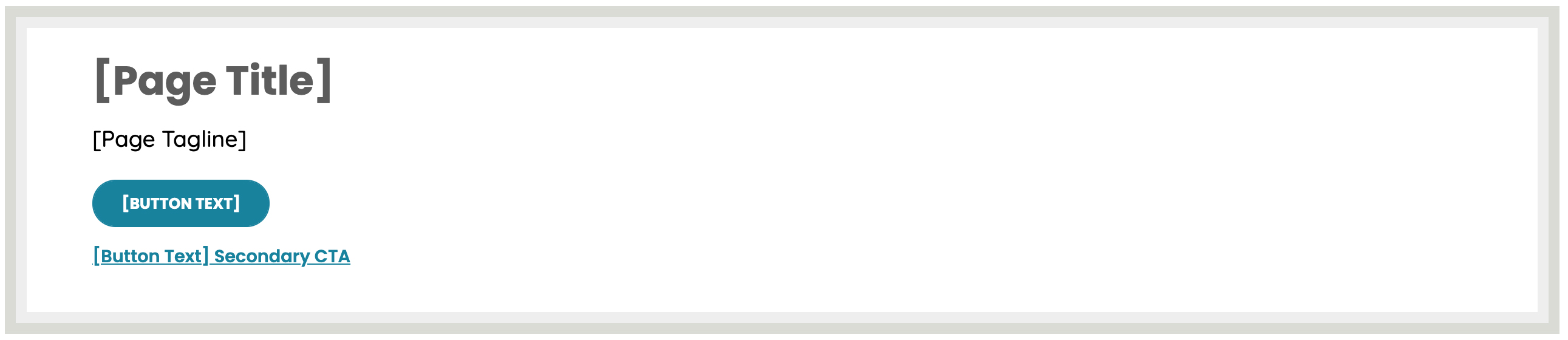
Note: [Bracketed] content is intended as a visual representation of the fields represented within the components admin area.

Hero Image Selection
Hero Image Size: 1049X670
When selecting images for the hero, consider the overlay on left side of the image. 150px of the image will be covered by the overlay on desktop views.
On mobile and tablet views, the image will crop on the top and bottom, to improve content density. When selecting images, ensure the focal point of the image will appear nicely in the cent of the image no matter the screen size.
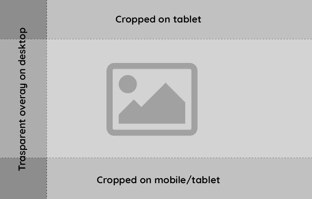
The admin area provides branded color options, select a color that is complimentary to the image, in the example above Teal is selected to compliment the colors of the image.
Images are not required for the hero, consider if the image is adding to the content of the page, for example, on a Rates page, getting the content higher on the page is more important than a hero image. The hero will adapt if no image is selected.