
Multi-Column Component
Component Guidelines and Best Practices
The Flexible Multi-Column with Images Component has many options and variation, it is best used to break-up content into smaller, easier to consume chunks of information. Rather than using a bulleted list for content, consider using this component.
Component Overview
Here is an overview of the component fields and their intended use. Use this guide to view how they will display on the site. Note: [Bracketed] content is intended as a visual representation of the fields represented within the components admin area.
The [Section Title] is used to introduce the area of content, for example "Benefits of OnPoint"
The [Section Intro] is used to give more detail about the section. For example “Here are all the perks our members enjoy about OnPoint” The Section Title and Section Intro are similar to the Intro Text Component, this should be used in place of the intro text component when the content is intended to be closely connected.
Column [Headline]
[Description] Lorem ipsum dolor sit amet, consectetur adipiscing elit, sed do eiusmod tempor incididunt ut labore.
Column [Headline]
[Description] Lorem ipsum dolor sit amet, consectetur adipiscing elit, sed do eiusmod tempor incididunt ut labore.
Column [Headline]
[Description] Lorem ipsum dolor sit amet, consectetur adipiscing elit, sed do eiusmod tempor incididunt ut labore.
Column [Headine]
[Description] Lorem ipsum dolor sit amet, consectetur adipiscing elit, sed do eiusmod tempor incididunt ut labore.
[Sidebar Content]
Sidebar Components are intended to build upon the content in that row. To improve content density and move content higher on a page, this should be used frequently and intentionally. View all Sidebar Content options and best uses.
Icons can be selected for visual impact
The Multi-Column Component has the flexibility of adding pre-programmed icons to add visual interest to the content.
Select an Icon
You are able to select from a list of predetermined icons in the backend. Users find icons to be actionable, it is recommended that when using icons, to add a link to each column. Also consider if the icon is adding to the content, excessive use of icons is not recommended.
Select background color
You are able to select from a variety of background colors for each icons from the [Icon texture color] selector. Consider if you would like to use a variety of colors [shown here] that compliment one another or all the same icon color [shown below].
Select Icon Color
Two different icon colors have been pre-programmed into the select, “light” (or cream) and ”dark” (or green), the icon should contrast well with the background color selected, if using a light background color, choose a “dark” as your icon variant.
Be Consistent
When selecting icons you can use different color backgrounds, but be consistent with icon colors, as you can see here the checkmark icon looks out of place, since it is a different color. If using Sidebar Content with an icon, it is not recommended to use icons within this component.
Icons shown with all the same color background, centered, and No Bordered Boxes Mode enabled.
[Headline 1]
Sed ut perspiciatis unde omnis iste natus error sit voluptatem accusantium doloremque laudantium, totam rem aperiam.
[Headline 2]
Sed ut perspiciatis unde omnis iste natus error sit voluptatem accusantium doloremque laudantium, totam rem aperiam.
[Headline 3]
Sed ut perspiciatis unde omnis iste natus error sit voluptatem accusantium doloremque laudantium, totam rem aperiam.
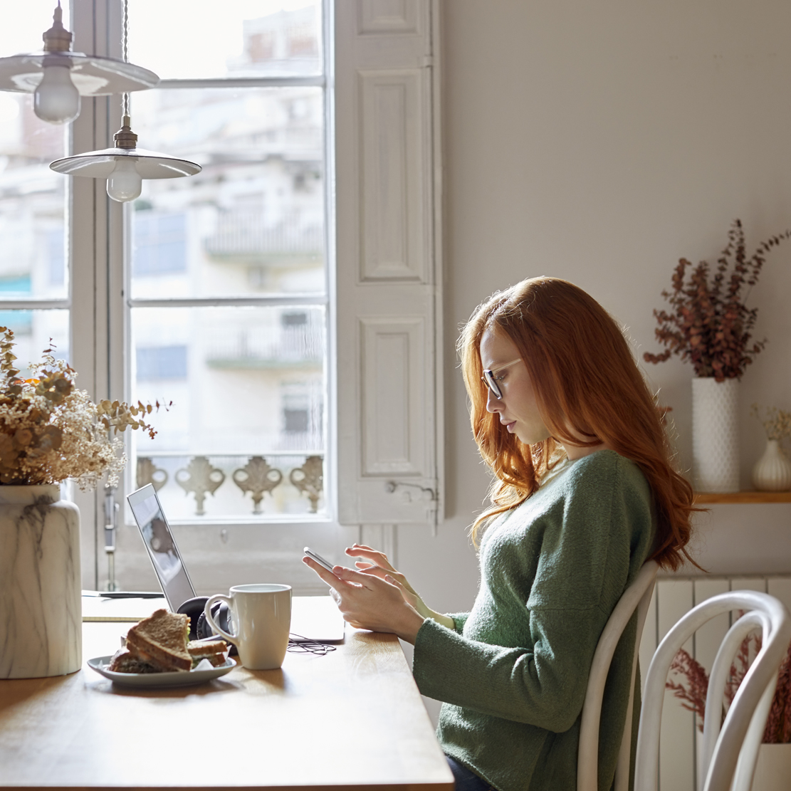
Images in Multi-Column Component
Image can add visual interest to a page and allow for users to scan content quicker. When using images in the Multi-Column Component, follow these guidelines.

Be consistent with image use
If you opt to use images in the component, use them in every row of the component, this will keep content aligned, and create visual symmetry.
Size the images properly
The suggested image size is 558X411 for this component, this will ensure that no matter the users screen size, the image will appear crisp. Smaller images will increase the chances of pixelation.
Shorter or taller images
You may find it necessary to use a shorter or taller image at times, to accommodate the content, it is important that the width of the image is always 558px, and the height of all images in the row are consistent.
Flexible Number of Columns & Stacking
The Flexible Multi-Column with Images Component has the flexibility of 2-4 columns per row, you may add additional rows which will continue to stack. Consider using multiples of 2 for a nice symmetry.
Align the columns
By default left alignment is selected. When using fewer columns set the alignment to center, this will allow for the content to have balanced white space on either side of the component. When using a sidebar, only 2 columns will display in a row, keep this in mind when building pages.
2-4 columns per row
Note above, the component with images is using 3 columns, and the one with icons is using 4 columns. It is important to select ‘Column Alignment: Center’ when using fewer than 4 rows.
Stacking Multi-Column Boxes
The Multi-Column Component is design to auto-stack boxes and align them based on the selections made. If using a sidebar component, two boxes will display and the third and fourth box will automatically move to the second row. If you want 3-4 boxes on one row, do not use a sidebar component.
Uneven rows & columns
It is acceptable and expected to have uneven columns and rows within a website. We strive for symmetry while building a page, but recognize that every screen size is different, and the content is intended to adapt to the users screen.
Alternate Uses and Background Options
Color Block Pattern 1
Use Color Block patterns when highlighting vital content on a page. This should be used minimally, and no more than once on a page, as they are intend to strongly emphasize content.
Visual Impact
Note only the first row of the component is highlighted with the background pattern, this is to ensure that the component is not overused and provides the intended impact.
Prioritize Content
Do not use sidebar content that will blend in with the background, for example the sidebar CTA is intended to have high contrast, using it on a Color Block Pattern Background will diminish its impact.
Background grows with sidebar
For visual symmetry, when Sidebar Content is senabled using a background pattern, the background patter will grown as tall as the sidebar.
Example of box bleeding outside of background
Sidebar Content and Block Patterns
Sidebar content may be used on the Block Pattern Backgrounds, keep in mind that the sidebar will be less impactful on these backgrounds. Using a CTA Component on this background would have less impact than it would on a white background.
Color Block Pattern 1
[Headline]
Lorem ipsum dolor sit amet, consectetur adipiscing elit, sed do eiusmod tempor incididunt ut labore et dolore magna aliqua.
[Headline]
Lorem ipsum dolor sit amet, consectetur adipiscing elit, sed do eiusmod tempor incididunt ut labore et dolore magna aliqua.
[Headline]
Lorem ipsum dolor sit amet, consectetur adipiscing elit, sed do eiusmod tempor incididunt ut labore et dolore magna aliqua.
[Headline]
Lorem ipsum dolor sit amet, consectetur adipiscing elit, sed do eiusmod tempor incididunt ut labore et dolore magna aliqua.
Cream Background Option
This should be used minimal as it is intended to break up page content on a page, and make a notable change within the content. When using sidebar components, they may have less of an impact on a cream background, keep this in mind when using the cream background option. It is not recommended to use the CTA component on cream, as it will lose its impact.
Cream Background option is also available on the Intro Text and Long Form Components, consider pairing these component together with cream background to form a section within longer page content.
[Headline]
Lorem ipsum dolor sit amet, consectetur adipiscing elit, sed do eiusmod tempor incididunt ut labore et dolore magna aliqua.
[Headline]
Lorem ipsum dolor sit amet, consectetur adipiscing elit, sed do eiusmod tempor incididunt ut labore et dolore magna aliqua.
[Headline]
Lorem ipsum dolor sit amet, consectetur adipiscing elit, sed do eiusmod tempor incididunt ut labore et dolore magna aliqua.
No Bordered Boxes Mode
No Bordered Boxes Mode removes the boxes around the content. This option works great as quick links, making the content feel more connected. It is not recommended to use this mode when Sidebar Content is selected or if more than 4 columns are being used within the component.
[Headline 1]
Sed ut perspiciatis unde omnis iste natus error sit voluptatem accusantium doloremque laudantium, totam rem aperiam.
[Headline 2]
Sed ut perspiciatis unde omnis iste natus error sit voluptatem accusantium doloremque laudantium, totam rem aperiam.
[Headline 3]
Sed ut perspiciatis unde omnis iste natus error sit voluptatem accusantium doloremque laudantium, totam rem aperiam.
[Headline 4]
Sed ut perspiciatis unde omnis iste natus error sit voluptatem accusantium doloremque laudantium, totam rem aperiam.
Sidebar Content
Within the Multi-Column Components there are multiple sidebar content options that can be used to help diversify the content displayed within a row. Here we cover those options and best practices for how to use them to increase content density and help visitors navigate the site.
Media Sidebar
The Media Sidebar is best used within the Multi-Column component when you only want to use one image, as this allows multiple boxes to reside next to the image. Select the image size that best matches the height of the content, using one one row consider using a shorter image, if using multiple rows, use a taller image.
[Headline 1]
Sed ut perspiciatis unde omnis iste natus error sit voluptatem accusantium doloremque laudantium, totam rem aperiam.
[Headline 2]
Sed ut perspiciatis unde omnis iste natus error sit voluptatem accusantium doloremque laudantium, totam rem aperiam.
[Headline 3]
Sed ut perspiciatis unde omnis iste natus error sit voluptatem accusantium doloremque laudantium, totam rem aperiam.
[Headline 4]
Sed ut perspiciatis unde omnis iste natus error sit voluptatem accusantium doloremque laudantium, totam rem aperiam.

Related Content Sidebar
This component includes and optional icon to support the content, when using the multi-column component it is recommended to not have icons in both the component and the sidebar, as they will not align properly and the icons are intended to provide prominence to the content.
[Headline 1]
Sed ut perspiciatis unde omnis iste natus error sit voluptatem accusantium doloremque laudantium, totam rem aperiam.
[Headline 2]
Sed ut perspiciatis unde omnis iste natus error sit voluptatem accusantium doloremque laudantium, totam rem aperiam.
Rate Shortcode
The Rate Shortcode Sidebar is not as wide as other sidebars, this allows for three columns to display on larger screen as opposed to two that other sidebar content allows.
[Headline 1]
Sed ut perspiciatis unde omnis iste natus error sit voluptatem accusantium doloremque laudantium, totam rem aperiam.
[Headline 2]
Sed ut perspiciatis unde omnis iste natus error sit voluptatem accusantium doloremque laudantium, totam rem aperiam.
[Headline 3]
Sed ut perspiciatis unde omnis iste natus error sit voluptatem accusantium doloremque laudantium, totam rem aperiam.
ADDITIONAL SIDEBAR OPTIONS
The Long Form Component is very flexible with the multiple sidebar content configurations.
Images
When using images in the Multi-Column component, use them in every instance of that component to create symmetry within the component.
Image Dimensions
Multi-Column Component
Suggested: 558X411
Variations: . 558X558, 558X700
All images in every column must be the same height, this will keep headline and buttons aligned, allowing content to appear symmetrical.
Media Sidebar
Recommended Size: 540X300
Variations: 540X540px, 540X700px [shown here]

Image variation
Tall Image
Tall Image
Shorter Image
Shorter Image
Be consistent with image sizes
As you can see in this example, the first row uses tall images, the second row uses shorter images be intentional about the image sizes you select to create symmetrical content and avoid things looking broken.