
Sidebar Content
Sidebar Content
Sidebar Components are intended to build upon the content in that row. To improve content density and move content higher on a page, they should be used frequently and intentionally.
Using background colors with sidebar content
This should be used minimal as it is intended to break up page content on a page, and make a notable change within the content. When using sidebar components, they may have less of an impact on a cream background, keep this in mind when using the cream background option. It is not recommended to use the CTA component on cream, as it will lose its impact.
Cream Background options is also available on the Intro Text components, pairing these component together will form a larger section.

Read more about image sizes and their options here.
Sidebar Content
Sidebar Content is an option within the Long Form and Multi-Column Components there are multiple sidebar content options that can be used to help diversify the content displayed within a row. Here are the options and best practices for how to use them to increase content density and help visitors navigate the site.
Bio Sidebar Component
The Bio Sidebar should be used when the text is describing ways to apply. For example, on a Home Loans Page, you may feature a Bio in the sidebar to encourage users to apply with that team member, as this is not the primary CTA for this row, you may wish to include additional buttons on this row. The Bio Sidebar Component has an optional Section Title, optional Quote and optional Read full bio text link. The content will pull from the team bio database, and is not manually curated.
If the content is not enough to balance out the text field and the bio component, consider adding a tall image to the media column within the Long Form Component or use multiple boxes with the Multi-Column Component, this will help balance out the content as shown.
Approximate Sidebar Dimensions: 540X700px
Sed ut perspiciatis unde omnis iste natus error sit voluptatem accusantium doloremque laudantium, totam rem aperiam, eaque ipsa quae ab illo inventore veritatis et quasi architecto beatae vitae dicta sunt explicabo. Nemo enim ipsam voluptatem quia voluptas sit aspernatur aut odit aut fugit, sed quia consequuntur magni dolores eos qui ratione voluptatem sequi nesciunt. Neque porro quisquam est, qui dolorem ipsum quia dolor sit amet, consectetur, adipisci velit, sed quia non numquam eius modi tempora incidunt ut labore et dolore magnam aliquam quaerat voluptatem. Ut enim ad minima veniam, quis nostrum exercitationem ullam corporis suscipit laboriosam, nisi ut aliquid ex ea commodi consequatur? Quis autem vel eum iure reprehenderit qui in ea voluptate velit esse quam nihil molestiae consequatur, vel illum qui dolorem eum fugiat quo voluptas nulla pariatur?

Optional [Section Title]
Adam Rousse
Calculators Sidebar Component
Use this component in context where a user may want to quickly use a calculator. This is intended to link directly to the specific calculator embedded lower on the page, or on the calculators page.
The component [Intro Text] should identify specifically what the calculators are for, ex. “Auto Loans Calculators,” as to make it very easy for users skimming the content.
There should be at least two calculators linked from the component to create a nice balance multiples of 2 are required, but not necessary. The option to add up to 8 calculators, but only use calculators that are specific to the content.
The is curated with the component and should be short and specifically identify what the calculator is for. Ex. ” Auto Loan Calculators” or “Calculate Your Savings.” It should be no more than 4 words to maintain the integrity of the design.
The [Button Text] is optional and should be used as a secondary call to action related to the calculators content. Ex. “See all calculators” or “Shop for a car.”
Approximate Sidebar Dimensions: 540X00px
Event Component Sidebar
The Event Component should be used to help promote an event related to the content. This content is pulled from pre-populated events posts. Visitors looking at the Home Loans section of the site may be interested in a First Time Homebuyer Event.
Approximate Sidebar Dimensions: 540X350px
Event Sidebar disabled
Event sidebar turned off, re-upload when content is available
Info List
When using the Info List sidebar, you should always include a Section Title, as this will help users to know what this list is in reference to. This component should used to pull out content to make it easier for users to skim the page.
If the list is sequential, use the “Use Numbered List” option. On default a bulleted list will display.
If there is required action, a optional text link field should be used.
Approximate Sidebar Dimensions: 540X500px
Media Sidebar Component
The Media Sidebar is best used within the Multi-Column component when you only want to display one image, as this allows multiple boxes to reside next to a single image.
If you have a lot of text that you want to display in the Long Form Component, use the Media Sidebar, as this will allow the text to go full-width of the screen allowing for better content density. When using this in the Long Form Component, the text will not wrap around the image. You may also choose to use an image in the Long Form Component as well as the Media Sidebar when you want two images within a row.
Approximate Sidebar Dimensions: 540X300px
Related Content Sidebar
The Related Sidebar Content Component is a great way to call out or highlight information that is related to the content it is next to. Example uses may be: Directing a user to “Shop for a New Car Online”
The background of this component is always grey, as it is intended to be supporting content, and not the main CTA of a row.
You may choose an icon to support the content in this component, if using and icon, it should compliment the content in the row, look at the images used in that row and find a color that compliments the images, if using icons in the row, it is not recommended to use an icon in the sidebar.
Approximate Sidebar Dimensions: 540X500px
Promo Component
The promo component pulls content that is pre-populated with the promotions section of the website. If the promo includes and image or icon, it will automatically display within this section.
Approximate Sidebar Dimensions: 540X500px
Rate Shortcode
Use the Rate Shortcode Sidebar to highlight a rate on a page. This is a great way to featured promotional rates, and inspire users to apply.
An Icon is optional, but encouraged, as it will create visual interest and draw users to the rate. Select a background color that compliments any images used in the Long Form Component.
The title should always be short and specific ie: “Used Auto Loans” a rate shortcode can be used in place of the featured rate, as it will update automatically based on the rate in the featured rate table.
Use short button text, ie. “Apply for an auto loan” and longer text in the secondary CTA, ie. “Find your closest location to apply”
Note: Images used on the Long Form text Component will display wider, as the Rate Shortcode Sidebar is not as wide as the other sidebar components. This helps the rate shortcode to stand out among other components. Be aware of this when stacking two Long Form Text Components on top of one another, as it can disrupt the symmetry of the page.
Multiple rates can be stacked within the component.
Approximate Sidebar Dimensions: 350X500px
Short Form Sidebar
The Short Form Sidebar is a great way to get the form right within the content. This can be used as a lead capture, if someone is looking at applying for a loan, a form with “Have someone contact you” can be featured right within the content.
Approximate Sidebar Dimensions: 540X600px
[Short Form Title]
Single Blog Sidebar
Use the Single Blog Sidebar as a way to support content. The content is pulled from pre-populated blog postings, and will display and image and icon category from that blog. An article about Auto Loans could be featured within the Auto Loans section of the website.
Approximate Sidebar Dimensions: 540X650px
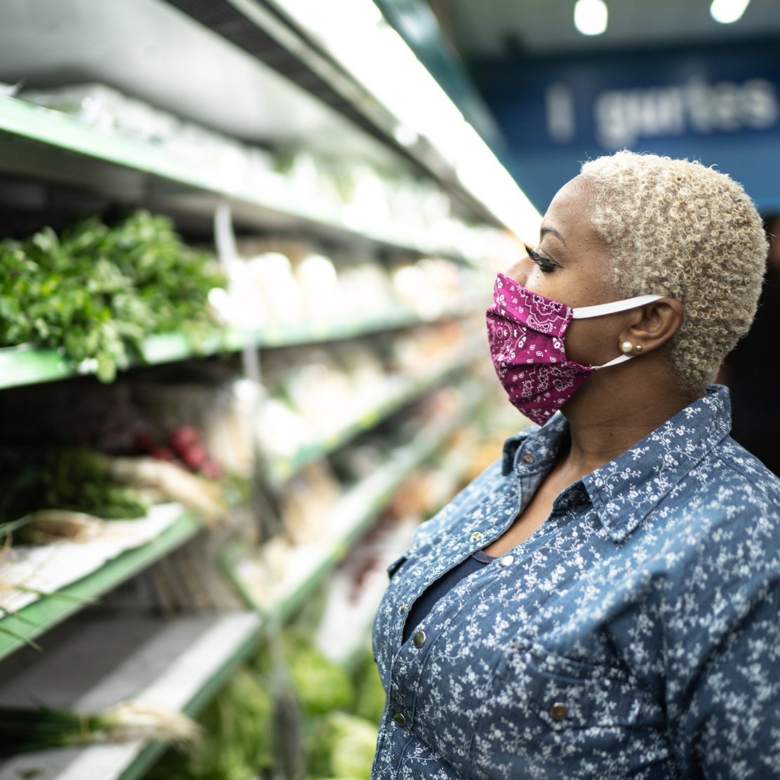
Financial Advice
15 Easy Ways to Save Money on Groceries
Single Path CTA in Sidebar
When using the Single Path CTA it should be the main CTA on row, consider using text links only in the Supporting Content of the main content, as this will allow you to add links that will not conflict with the main CTA, enticing users to take the main call to action. This component should be used higher on a page, as the main CTA of the page should be full width and near the bottom of the page.
Use the single path CTA sparingly on cream or grey backgrounds. As the CTA should be the main priority, and it will have less impact on a cream background
Approximate Sidebar Dimensions: 540X600px
Single Path CTA Sidebar [Title]
An optional description can be added, but is not required [CTA Description]
Tip Sidebar
The Tip Sidebar contains a Section Title, Section Intro, and Button. The content is completely curated, and has the option to include in-text links within the section into. This component is a great way to call out content that is within the body of the row.
Approximate Sidebar Dimensions: 540X300px
[Section Title]
[Section Intro]