

OnPointcu.com Brand Refresh Guidelines
General Component Guidelines to Build User Friendly Webpages
This page is intended as guide to help build user friendly pages, ensure the brand guidelines of OnPoint are well represented and inform best practices for webpage construction. This guide is intended to evolve and change, and can be modified at the discretion of the page creator.
[Bracketed content is intended as a visual representation of the fields represented within the components admin area].
The Into Text Component [Section Title]
The Intro Text Component is intended as the first component of a page, to introduce a visitor to the content below, when used in this way, it should be used above the Sticky Navigation.
It can also be used to break a page up into categories, and create obvious page breaks within content.
For example, on a product page, you may want a section that delineates an overview of the product, and a section on how to apply, these headlines would work well with the branded appearance turned on within the Intro Text Component.
Note: If the intro text is closely related to the content directly below, use the Section Title & Section Intro within that component, as it will create minimal spacing between the intro and the content (note the spacing between this and the next component).
[Section Intro]
Intro Text with Branded Appearance
The Intro Text Component with branded appearance enabled is designed to break a page up into categories, and create obvious page breaks within content. It should be used minimally and with short headlines. This variation of the Intro Text component is not intended as the first component to start the page.
Flexible Long Form Component
The Flexible Long Form Component is diverse and has many variations including optional Sidebar Content, this next section will show the variations, and best practices for using them.
The [Section Title] is used to introduce the area of content, for example "How can I apply?"
The [Section Intro] is used to give more detail about the section. For example “Are you ready to apply, this section will help you gather what you need before you start.” The Section Title and Section Intro are similar to the Intro Text Component, this should be used in place of the intro text component when the content is intended to be closely connected.
The [Subhead] is to give more context to the section as needed, for example" Documents Required"
The [Supporting Content] field is used to provide long descriptive text about the section. This is intended to be at least a few sentences long, and only up to a few paragraphs should be displayed on default. If more than a paragraph is required, it is recommended that the “Show Read More Link” is used as shown here.
Anything below the read more link will only display if the user selects read more. Priority content that you want all users to see in should not be put in the More Content section.
Sed ut perspiciatis unde omnis iste natus error sit voluptatem accusantium doloremque laudantium, totam rem aperiam, eaque ipsa quae ab illo inventore veritatis et quasi architecto beatae vitae dicta sunt explicabo. Nemo enim ipsam voluptatem quia voluptas sit aspernatur aut odit aut fugit, sed quia consequuntur magni dolores eos qui ratione voluptatem sequi nesciunt. Neque porro quisquam est, qui dolorem ipsum quia dolor sit amet, consectetur, adipisci velit, sed quia non numquam eius modi tempora incidunt ut labore et dolore magnam aliquam quaerat voluptatem. Ut enim ad minima veniam, quis nostrum exercitationem ullam corporis suscipit laboriosam, nisi ut aliquid ex ea commodi consequatur? Quis autem vel eum iure reprehenderit qui in ea voluptate velit esse quam nihil molestiae consequatur, vel illum qui dolorem eum fugiat quo voluptas nulla pariatur?

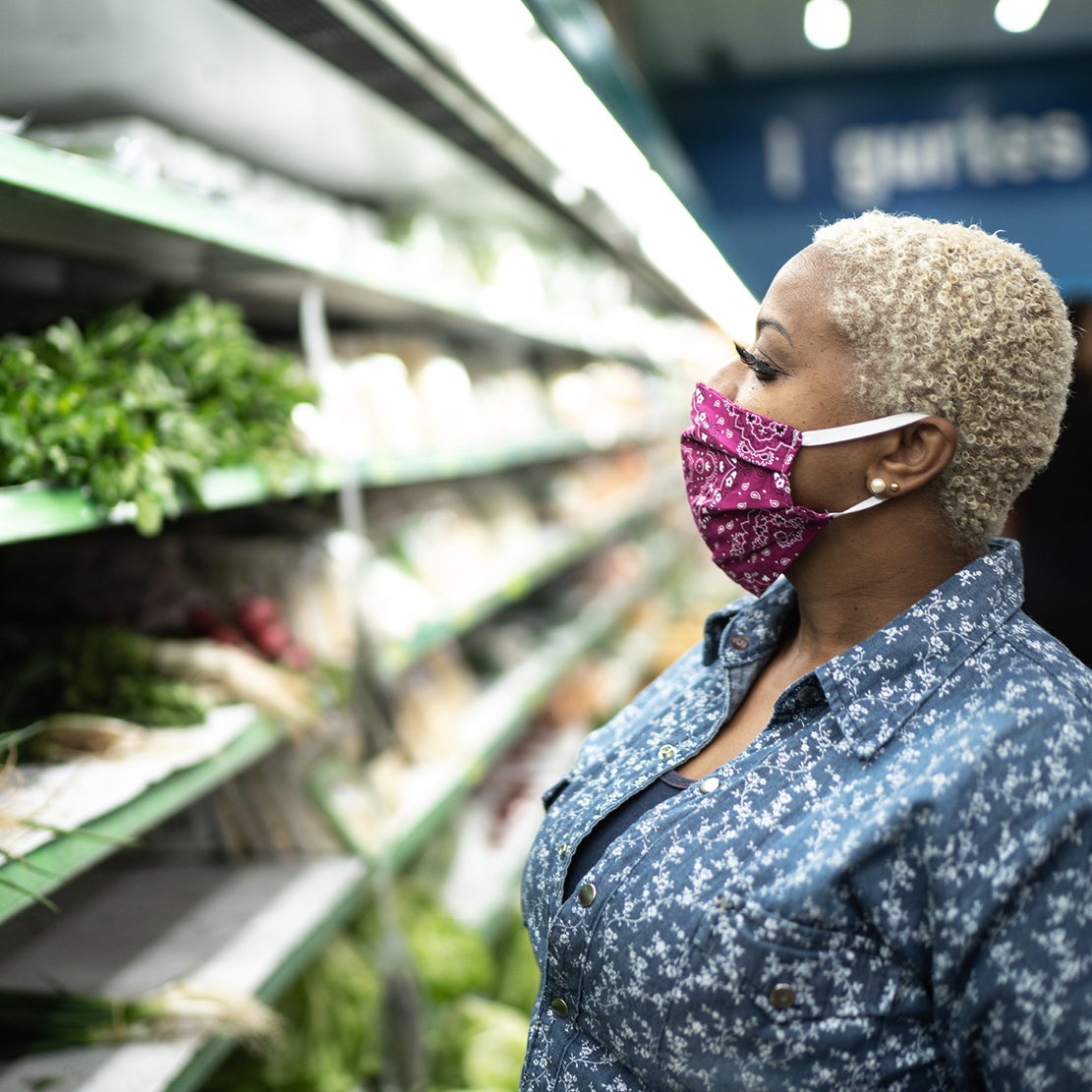
Image should be used in the Long Form Text Component to add visual interest to the content, it may display on the right or left of the content. When using a sidebar, it is recommended the image be placed on the left, allowing the text to go between the two. The height of the image is flexible and should be adjusted to created balanced page content.
Stack Multiple Long Form Text Components
You can stack multiple Long Form Text Components in a row. Do not use the Section Title & Section Into when the content is intended to feel connected. Only use the Section Intro and Title to break up sections, this also enables you to stack multiple sidebar elements in one section, as shown here.
Read moreStacking Tip
If stacking Long Form Text Component, be consistent with the use of sidebar components, as this will help the content to stay symmetrical to the content above and/or below.
Sidebar Content
Within the Long Form and Multi-Column Components there are multiple sidebar content options that can be used to help diversify the content displayed within a row. Here we cover what options are and best practices for how to use them to increase content density and help visitors navigate the site.
Bio Sidebar Component
The Bio Sidebar should be used when the text is describing ways to apply. For example, on a Home Loans Page, you may feature a Bio in the sidebar to encourage users to apply with that team member, as this is not the primary CTA for this row, you may wish to include additional buttons on this row. The Bio Sidebar Component has an optional Section Title, optional Quote and optional Read full bio text link. The content will pull from the team bio database, and is not manually curated.
If the content is not enough to balance out the text field and the bio component, consider adding a tall image to the media column within the Long Form Component or use mutiple boxes with the Multi-Column Component, this will help balance out the content as shown.
Sed ut perspiciatis unde omnis iste natus error sit voluptatem accusantium doloremque laudantium, totam rem aperiam, eaque ipsa quae ab illo inventore veritatis et quasi architecto beatae vitae dicta sunt explicabo. Nemo enim ipsam voluptatem quia voluptas sit aspernatur aut odit aut fugit, sed quia consequuntur magni dolores eos qui ratione voluptatem sequi nesciunt. Neque porro quisquam est, qui dolorem ipsum quia dolor sit amet, consectetur, adipisci velit, sed quia non numquam eius modi tempora incidunt ut labore et dolore magnam aliquam quaerat voluptatem. Ut enim ad minima veniam, quis nostrum exercitationem ullam corporis suscipit laboriosam, nisi ut aliquid ex ea commodi consequatur? Quis autem vel eum iure reprehenderit qui in ea voluptate velit esse quam nihil molestiae consequatur, vel illum qui dolorem eum fugiat quo voluptas nulla pariatur?

Read more about image sizes and their options here.
Optional [Section Title]
Adam Rousse
Calculators Sidebar Component
Use this component in context where a user may want to quickly use a calculator. This is intended to link directly to the specific calculator embedded lower on the page, or on the calculators page.
The component [Intro Text] should identify specifically what the calculators are for, ex. “Auto Loans Calculators,” as to make it very easy for users skimming the content.
There should be at least two calculators linked from the component to create a nice balance multiples of 2 are required, but not necessary. The option to add up to 8 calculators, but only use calculators that are specific to the content.
The is curated with the component and should be short and specifically identify what the calculator is for. Ex. ” Auto Loan Calculators” or “Calculate Your Savings.” It should be no more than 4 words to maintain the integrity of the design.
The [Button Text] is optional and should be used as a secondary call to action related to the calculators content. Ex. “See all calculators” or “Shop for a car.”
Event Component Sidebar
The Event Component All
Info List
When using the Info List sidebar, you should always include a Section Title, as this will help users to know what this list is in reference to. This component should used to pull out content to make it easier for users to skim the page.
If the list is sequential, use the “Use Numbered List” option. On default a bulleted list will display.
If there is required action, a optional text link field should be uses.
Media Sidebar Component
The Media Sidebar is best used within the Multi-Column component when you only want to use one image, as this allows multiple boxes to reside next to the image.
When using this in the Long Form Component, the text will not wrap around the image, as shown below. If you have a lot of text that you want to display in the Long Form Component, use the Media Sidebar, as this will allow the text to go full-width of the screen allowing for better content density.
Media In Component (not sidebar)
When using the Media with the Long Form Component, with a lot of text, turn on the Wrap Media with text functionality, as this will allow content to flow around the image, and improve content density.
Sed ut perspiciatis unde omnis iste natus error sit voluptatem accusantium doloremque laudantium, totam rem aperiam, eaque ipsa quae ab illo inventore veritatis et quasi architecto beatae vitae dicta sunt explicabo. Nemo enim ipsam voluptatem quia voluptas sit aspernatur aut odit aut fugit, sed quia consequuntur magni dolores eos qui ratione voluptatem sequi nesciunt. Neque porro quisquam est, qui dolorem ipsum quia dolor sit amet, consectetur, adipisci velit, sed quia non numquam eius modi tempora incidunt ut labore et dolore magnam aliquam quaerat voluptatem. Ut enim ad minima veniam, quis nostrum exercitationem ullam corporis suscipit laboriosam, nisi ut aliquid ex ea commodi consequatur? Quis autem vel eum iure reprehenderit qui in ea voluptate velit esse quam nihil molestiae consequatur, vel illum qui dolorem eum fugiat quo voluptas nulla pariatur?
Sed ut perspiciatis unde omnis iste natus error sit voluptatem accusantium doloremque laudantium, totam rem aperiam, eaque ipsa quae ab illo inventore veritatis et quasi architecto beatae vitae dicta sunt explicabo. Nemo enim ipsam voluptatem quia voluptas sit aspernatur aut odit aut fugit, sed quia consequuntur magni dolores eos qui ratione voluptatem sequi nesciunt. Neque porro quisquam est, qui dolorem ipsum quia dolor sit amet, consectetur, adipisci velit, sed quia non numquam eius modi tempora incidunt ut labore et dolore magnam aliquam quaerat voluptatem. Ut enim ad minima veniam, quis nostrum exercitationem ullam corporis suscipit laboriosam, nisi ut aliquid ex ea commodi consequatur? Quis autem vel eum iure reprehenderit qui in ea voluptate velit esse quam nihil molestiae consequatur, vel illum qui dolorem eum fugiat quo voluptas nulla pariatur?
Related Content Sidebar
The Related Sidebar Content Component is a great way to call out or highlight information that is related to the content it is next to. Example uses may be: Directing a user to “Shop for a New Car Online”
The background of this component is always grey, as it is intended to be supporting content, and not the main CTA of a row.
You may choose an icon to support the content in this component, and choose an icon color that will compliment the content, a bright (orange, green) background will draw attention to the component, where more muted tones will be less attention grabbing (blue, green)
Read morePromo Component
Use this component in context where a user may want to quickly use the calculators. This is intended to link directly to the calculator, and should have at least two calculators linked from the component.
The component headline should identify specifically what they calculators are for, ex. “Auto Loans Calculators”
The button text should identify what the calculator will do, for ex. “Calculator your Auto Loan Payment” or “Calculate Your Savings” this will help users to know exactly what the calculator will do.
Rate Shortcode
Use the Rate Shortcode Comonent to highlight a rate on a page. This is a great way to featured promotional rates, and inspire users to apply.
An Icon is optional, but encouraged, as it will create visual interest and draw users to the rate. Select a background color that comopliments any images used in the Long Form Text Component.
The title should always be short and specific ie: “Used Auto Loans” a rate shortcode can be used inplace of the featured rate, as it will update automatically based on the rate in the featured rate table.
Use short button text, ie. “Apply for an auto loan” and longer text in the secondar CTA, ie. “Find your closest location to apply”
Note: Images used on the Long Form text Component will display wider, as the Rate Shortcode Sidebar is not as wide as the other sidebar components. Be aware of this when stacking two Long Form Text Components on top of one another.
Short Form Sidebar
The Short Form Sidebar
[Short Form Title]
Single Blog Sidebar
The Single Blog Sidebar
Financial Advice
15 Easy Ways to Save Money on Groceries
Single Path CTA in Sidebar
When using the Single Path CTA it should be the main CTA on row, consider using text links only in the Supporting Content of the main content, as this will allow you to add links that will not conflict with the main CTA, enticing users to take the main call to action. This component should be used higher on a page, as the main CTA of the page should be full width and near the bottom of the page.
Use the single path CTA sparingly on cream or grey backgrounds. As the CTA should be the main priority, and it will have less impact on a cream background
Single Path CTA Sidebar [Title]
An optional description can be added, but is not required [CTA Description]
Flexible Multi-Column with Images Component
The Flexible Multi-Column with Images Component has many variations as well, it is intended to break-up content into chunks when content in shorter, and lots of it can be grouped into smaller chunks. Rather than using a bulleted list for content, consider using this component.
Icons can be selected for visual impact [Headline]
The Multi Column Component has the flexibility of using images, icons to add visual interest to the content.
Select Icons [Headline]
You are able to select from a list of predetermined icons in the backend.
Select Icon texture color [Headline]
You are able to select from a variety of background colors for each icons from the [Icon texture color] selector. Consider if you would like to use a variety of colors [shown here] that compliment one another all the same icon color [shown here].
Select Icon Color [Headline]
Two different icon colors have been pre-programmed into the select, “light” (or cream) and ”dark” (or green), the icon should contract well with the background color selected, if using a light background color, choose a “dark” as your icon variant. Always use select the same icon variant within one component.
Be Consistent [Headine]
When selecting icons you can use different color background textures, but be consistent with icon colors, as you can see here the checkmark icon looks out of place, since it is a different color.
No Bordered Boxes Mode
No Bordered Boxes Mode removes the boxes around the content. This option works great as quick links, as the content is less separated and work best when no sidebar content is selected. If more than 4 columns are being used, do not use No Bordered Boxes Mode.
[Headline 1]
Sed ut perspiciatis unde omnis iste natus error sit voluptatem accusantium doloremque laudantium, totam rem aperiam.
[Headline 2]
Sed ut perspiciatis unde omnis iste natus error sit voluptatem accusantium doloremque laudantium, totam rem aperiam.
[Headline 3]
Sed ut perspiciatis unde omnis iste natus error sit voluptatem accusantium doloremque laudantium, totam rem aperiam.
[Headline 4]
Sed ut perspiciatis unde omnis iste natus error sit voluptatem accusantium doloremque laudantium, totam rem aperiam.
Images in Multi-Column Component
When using images in the Multi-Column Component, follow these guidelines.

If using images, always use images
If you opt to use images in the component, use them in every row of the component, this will keep content aligned, and create nice visual.
Size the images properly
The suggested image size is 558X411 for this component, this will ensure that no matter users screen size, the image will appear crisp. Smaller images will increase the chances of pixelation in the image.
Shorter or Taller Images
You may find it necessary to use a shorter or taller image at times, to accomodate the content, it is important that the width of the image is always 540px, and the height of all images in the row are consistent.
Flexible Number of Columns
The Flexible Multi-Column with Images Component has the flexibility of 2-4 columns per row, you may also add additional columns up to
Column Alignment
By default Left Alignment is selected when using fewer columns, you may want to align center, this will allow for the content to have balanced white space on either side of the component. When only using 2 columns, you may consider using a sidebar component to support the content on that row.
2-4 Columns per row
Note above, the component with images is using 3 columns, and the one with icons is using 4 columns. It is important to select ‘Column Alignment: Center’ when using fewer than 4 rows.
Alternate Uses and Background Options
Stacking Multi-Column Boxes
Component is design to auto-stack boxes and alight them based on the selections made. If using a sidebar component, two boxes will display and the third and fourth box will automatically move to the second row. If you want 3-4 boxes on one row, do not use a sidebar component.
No Bordered Boxes Mode
When “No Bordered Boxes Mode” is selected in the admin area, there will be no outline around the boxes. Choose this option when a background color (such as Color Block 1 as shown), or when using a white background and no description for the boxes.
Example of 3rd box stacking
Example of no description.
Color Block Pattern 2 [Section Title]
[Section Intro] Color Block Patterns (variaion 1 & 2) should be used when you want to add impact to content. This is a great way to tell a user to pay close attention to this content. These background patterns should be used sparingly.
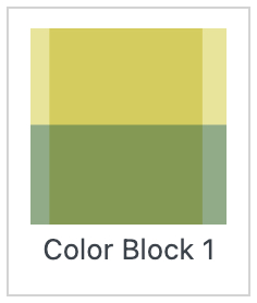
Color Block 1 (shown above)
Use Color Block patterns when highlighting vital content on a page. This should be used minimally, and no more than once on a page, as it’s intend is to strongly emphasize content. For example, you may choose to use this
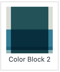
Color Block 2 (shown here)
Use Color Block patterns when highlighting vital content on a page. This should be used minimally, and no more than once on a page, as it’s intend is to strongly emphasize content. For example, you may choose to use this
Cream & Grey
Cream and Grey Background options are only available on the Long Form Component and Intro Text components. When using the cream background, use it as a way to break up content. You may want to user an intro text and long form component with a color background next to each other as a way to group a section.
Style 3
Style 4
Sidebar Content and Block Patterns
Sidebar content may be used on the Block Pattern Backgrounds, keep in mind that the sidebar will be less impactful on these backgrounds. Using a CTA Component on this background would have less impact than it would on a white background.
Single-path CTA with optional descriptive text
This text is optional, and can be up to a few sentences long.
Single-path CTA - no descriptive text
Short button textUse secondary CTA link for supporting contentImages, Icons & Buttons
Buttons and Secondary CTA
How to use buttons within a page.
How and when to use buttons
Most components have the option to use a you can also use a secondary cta or text link instead of a button, but how do they differ?
Most components have the option to use a you can also use a secondary cta or text link instead of a button, but how do they differ?
Buttons: Buttons should be short and concise, making it easy for the user to know where clicking the button will take them, as well as maintain the design integrity of the button shape. Buttons are intended to be pill shaped, to maintain this, CTA text must be short and specific, consider limiting words used to help the user to quickly identify where this will take them.
For example: “Open an OnPoint Interest Earning Checking Account today”, should be modified to “Open a Checking Account,” “Schedule an in-person or phone appointment now” could be modified to “Schedule an appointment.”
Secondary CTA or Text Links: Consider using a text link, rather than a button, for example: at the end of a blurb of text, you may want to inspire the user to “Request a complimentary consultation with a mortgage lender” this text would be better suited in a text link, rather than a button.
Buttons & Secondary in CTAs in Hero: In cases where a secondary CTA and a button are used in the hero, be sure to use concise text to maintain the appearance of a visually interesting button and grab the users attention quickly, and the secondary CTA for the next option. Example: Consider “Request a consultation” for the button and “Speak to one of our knowledgable mortgage consultants today” would work for the secondary CTA
This should show an image with CTA buttons short, longer X as well as secondary CTA
Images
This section will cover image sizes, when to use and not images, as well as background options for images
Borders & Alignment
Image alignment: Within the Long Form Component, you may choose the align an image to the Right or Left of the Content (aligned right in this instance). If using Sidebar Content, it is recommended that the image be aligned left, the contents of the component (image, the content block and the sidebar) will appear symmetrical.
Image borders: On default images with the Long Form text component will have a transparent white border inset on them. If you want to add more depth to an image, you may want to add a branded element to the photography on the page. If using a Long Form Text component with no sidebar content, adding a border to an image is a great way to add a design element to a row adding an OnPoint branded feel.
Read moreImage here shown with Green Background Selected.
Image Dimensions
The Suggested Image Dimensions for each component are:
Long Form Text component
Recommended Size: 540X300
Variations: Height can go up to 540X700 [shown here], borders around will adjust to accommodate the size of the image that has been uploaded. If using a taller sidebar component, like a Bio or CTA, you should consider a taller image,
Media Sidebar
Recommended Size: 540X300
Variations: Height can go up to 540X700px [shown here]
Multi-Column
Suggested: 558X411
Variation: Height can go up to 558X800, but all images in every column must be the same height, this will keep headline and button aligned, allowing content to appear symmetrical.
Hero Images: 1049×670
Hero Image Selection
When selecting images for the hero, consider the overlay on left side of the image. 150px of the image will be covered by the overlay. Select a color that is complimentary to the image, for example a image of woman driving an orange car would pair well with the Orange Hero options.